During the month of April, what was the best-performing asset? If you were to invest X amount of dollars on the first, where would it be on the very last day of that month? In this video, I’m going to go over a select few assets and track their performance during the month of April, then weigh the performance against my own personal algorithmic trading software to see if I beat other markets for the month of April. Without further ado, let’s get straight to it.
Welcome! If you’re new to the channel, my name is Matt Jimenez. I’m an entrepreneur who has worked with the greatest minds in finance over the last several years, and I’m here to share with you everything they’ve shared with me. When it comes to investing, there are so many vehicles to look at, and in this video, I want to go over a select few categories and weigh their performance against the FED bot from Nurp. If you haven’t been watching my journey, I’m tracking $50k right here in this video up above, where you can see how well it’s been doing for me since I started using the software. I actually want to weigh April’s performance from this software against other assets and see where I would have gotten the best yield if I invested money on the very first and held it to the very end of April.
The different assets I like to go over are cryptocurrencies, commodities, equities, and real estate. Now enough of that, let’s look at the charts.
Okay, so here I have the chart of Bitcoin, and I’m going to use this handy tool on the far left. Go ahead and click this. If you don’t know what it is, it’s a measuring instrument that you place on charts to see how well it did from where you click it to where you drop it. For this video, as I said, we’re going to track the month of April. I’m just going to hover over the first candle that is April 1st, which is this one here, and this candle close is right here. From here to here is the full month of April on the Bitcoin chart. Here I have the daily chart up for convenience and to see all the candles and trading action for the month of April. If I had invested in Bitcoin on the very first to the 30th, I would have actually lost 13.27%. That is a no-go for me when it comes to Bitcoin.
Now let’s go ahead and swing over to gold. Gold has had a nice run lately. Gold has been quite dormant, so seeing this price action is very comforting because I’ve been invested in gold for quite a while. There have been numerous times where I thought it was going to run due to certain turmoil in the economy, but it really didn’t move. Now, I’m actually starting to see the run, so it’s been exciting. Swinging over to the first of April, which is this candle right here, and this was the candle close. If I drag and drop, this is the 30th of April. Ironically, you would have made 1.37% in April. It did have a nice swing to the upside, but unfortunately, by the time the month closed, it gave back pretty much all the gains it made. Let’s actually go ahead and track that swing here, about a 7% swing to the upside, and then end up closing the month off pretty weak.
Let’s throw the Dollar Index, the oddball, in there and look at the DXY. This is the Dollar Index, which I find quite interesting to always track because it gives insights into how it’s going to do. When you weigh all other assets, they are typically weighed in dollars. If we have dollar strength coming in, it typically reflects in the other asset prices that are weighed against dollars. Here we have the Dollar Index. Let’s go ahead and track the month. I like to do this because it shows if I just left my money in my bank account and did nothing with it, did I actually gain or lose any of its value? So, this is April 1st right here at this candle close, and where is April 30th? Right here. Wow, if I had just left my money in my bank account in dollars, I actually would have done better than investing it in Bitcoin. Ironically.
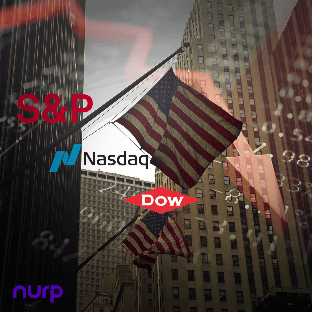
Now let’s swing over to the S&P 500. This chart for some reason freaks me out because it is so relentless. Obviously, we know that it’s heavily manipulated to continuously look like it’s always doing well. Back in the day, we used to have a world where the economy reflected equities and markets. Now, we have the complete decoupling of the economy from the performance of the stock market. Yet, we have all-time highs back-to-back in equities, which I find quite ironic. Now let’s look from April 1st down to the 30th. If you bought traditional equities, the S&P that is, you would have been down 3.92% for the month of April. So far, this is one of the worst performers.
Over here, I have the Vanguard Real Estate ETF. It’s not the exact prices and overall market of real estate, but it gives us a nice gauge on where we are in real estate on average. Let’s grab our tool one more time, and then I want to get into looking at how my software did for April and compare it. Here is April 1st, let’s bring it over to the 30th. If you had your money in Vanguard Real Estate, chances are you took a loss of about 4.69%, almost 5%. This is the worst performing one right next to the S&P.
Now let’s swing over to my software.
Here we are. This is my FED bot. Again, if you haven’t been watching the series, here it is one more time up above. Go ahead and watch it. It is very interesting to see, but this video is not dedicated to that; it’s strictly for April’s performance. For April, we did 4.7% positive. This is an amazing performing asset in comparison to all the other ones. Here are all the pairs that we traded during that time, and over here are all the different average holding times for April. The longest trade was the Aussie dollar/New Zealand dollar for 3 weeks. I’ve actually never seen anything like that. The risk-to-reward ratio is shown here. What I like about this software is it shows the risk-to-reward ratio for every single pair. Since you have full sovereignty over this software, you can eliminate or add and critique which pairs you want to trade. Based on charts and data like this, you can make your own educated decision to eliminate pairs, add pairs, or double down on pairs and change the risk. The tool is for you to use. There are standard settings, but again, it’s your software, and you get to critique it however you like.
With information like this, it is very beneficial because you can make decisions to potentially beat the norm. As they always say, “Challenge the norm, achieve the exceptional.”
As you can see, the software was the number one contender when weighed against all the others. The most interesting part is that, as highlighted in a video I made about uncorrelated assets right here, I demonstrate the utility of having a vehicle that can continue to make gains for you while there’s blood in the markets. Traditional markets were down, Bitcoin was down, gold was barely doing anything, and the software still performed at 4.7%, almost 5%. This shows it is not correlated to stocks. I pulled up the S&P 500, and it was down a significant amount while this was up, meaning it is completely uncorrelated. That is the power of having something uncorrelated in your portfolio. It has so much benefit and helps mitigate risk.
If that interests you, go ahead and hit the link down below to find out more about this software. Even if you don’t, at least you get to enjoy these videos that I make for you every week. Please hit the like button and subscribe. If you want to see more, leave a comment down below. I’m willing to compare this software to any assets you guys are interested in. As always, my friends, peace.
Please visit This Asset Performed Better Than All Others | April to watch the full video on YouTube!
The post This Asset Performed Better Than All Others | April first appeared on Nurp.com.